My Work
The Balance of Abstract Art
Abstract painting, much like music, depends on balance. Every color has a role to play; some take the lead, while others provide rhythm, contrast, or a quiet place for the eye to rest. The placement and proportion of each color can completely change how a painting feels.
I think of it like a band. Would a song sound the same without the drums? Take away the bass or guitar and the entire composition changes. Abstract painting works the same way. Remove the blue, move the red, or add more yellow, and suddenly the painting has a different rhythm, energy, and emotion.
When I look at abstract painting, I don’t look for an object or try to figure out what I see. Instead, I follow the movement. I take note of where my eyes go first and where they travel next. I look for a feeling or an emotion.
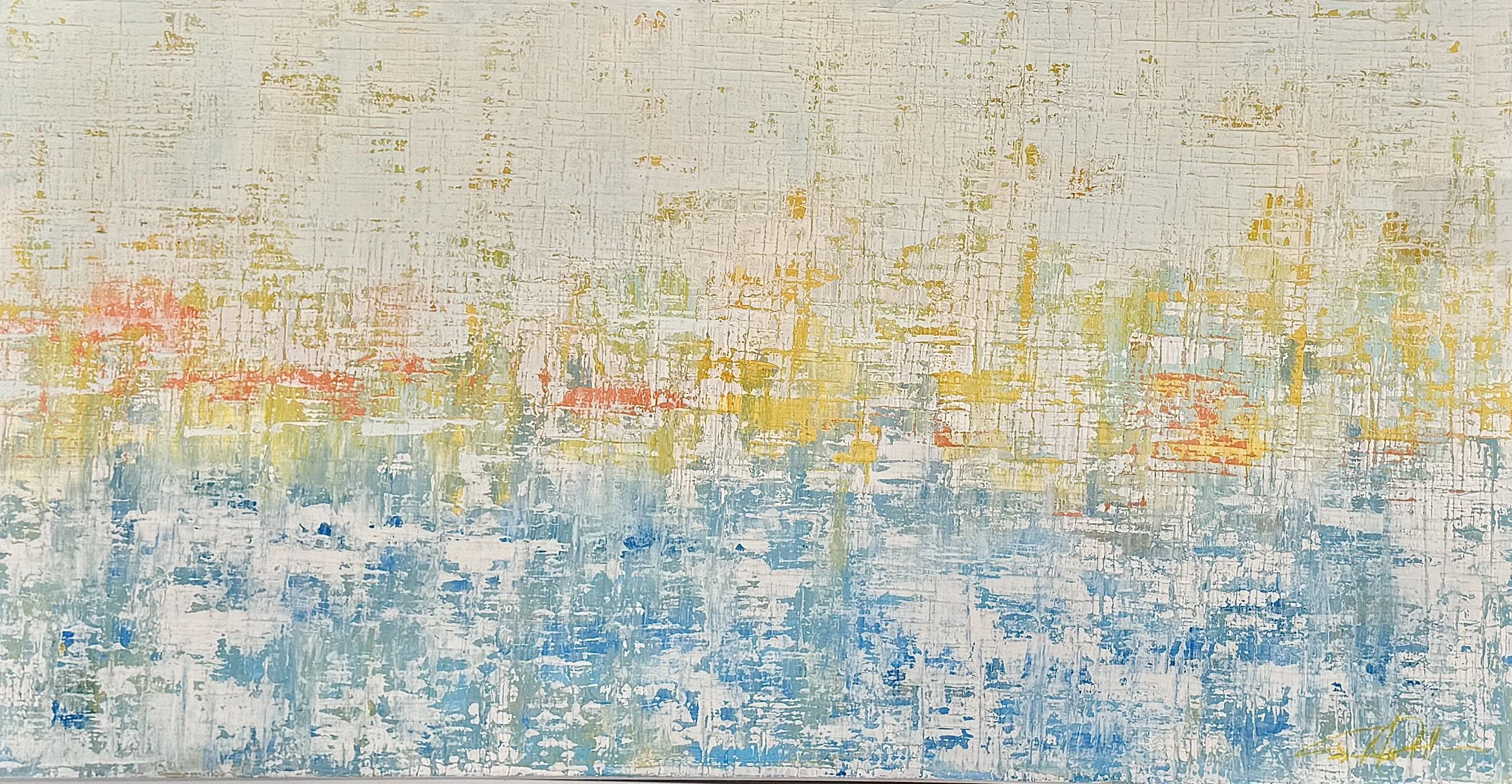
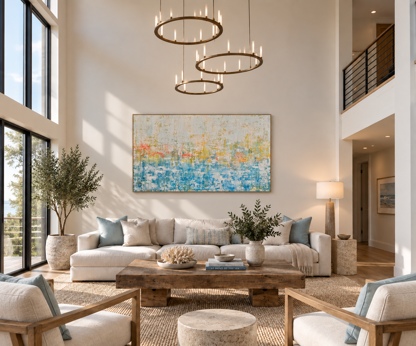
Ocean Sunset
Ocean Sunset captures the easy rhythm and energy of life by the water. Layers of color, movement, and texture suggest sun, sand, ocean, and sky—not as a literal place, but as a feeling. It’s about those moments when the day slows down, the breeze comes in, and everything simply feels a little lighter.
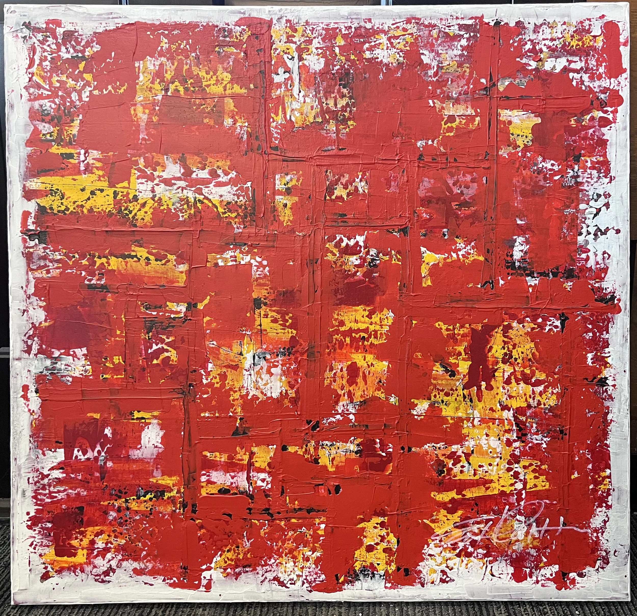
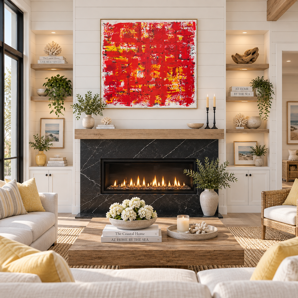
Happy Meal is a playful abstract inspired by the bold red and yellow colors associated with McDonald’s. Energetic strokes, layers, and movement tap into the nostalgia and simple excitement of a familiar childhood treat, transforming an iconic color palette into something expressive, joyful, and unexpected.
Happy Meal
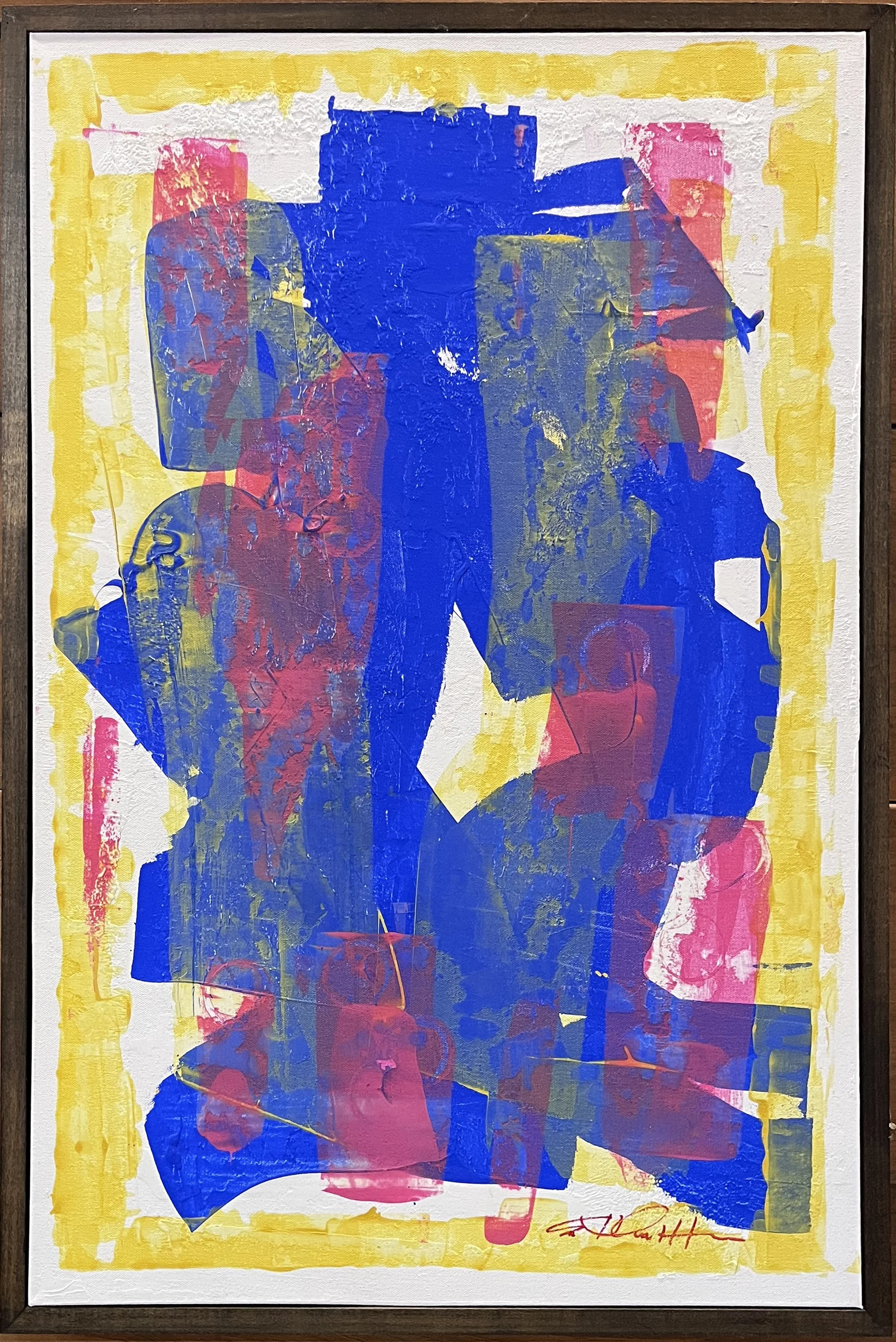
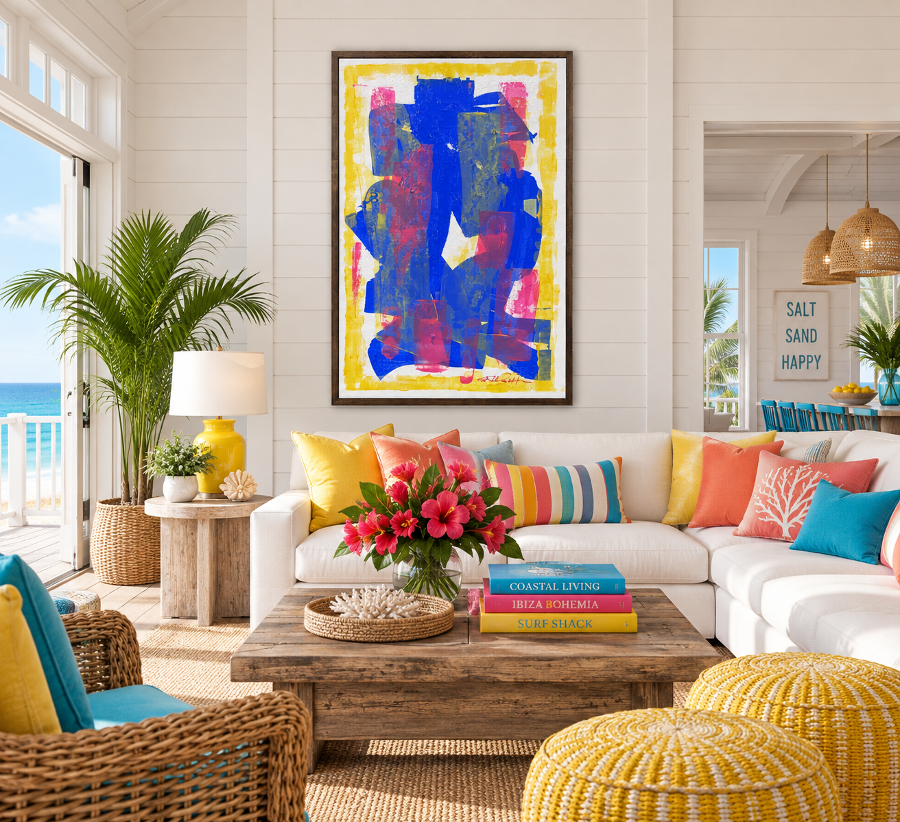
Primary Distraction is a bold exploration of color, shape, and movement. Vibrant blues, yellows, and flashes of pink overlap and compete for attention, creating a playful visual tension. Layers of texture and unexpected forms invite the eye to wander, embracing distraction as part of the experience.
Primary Distraction
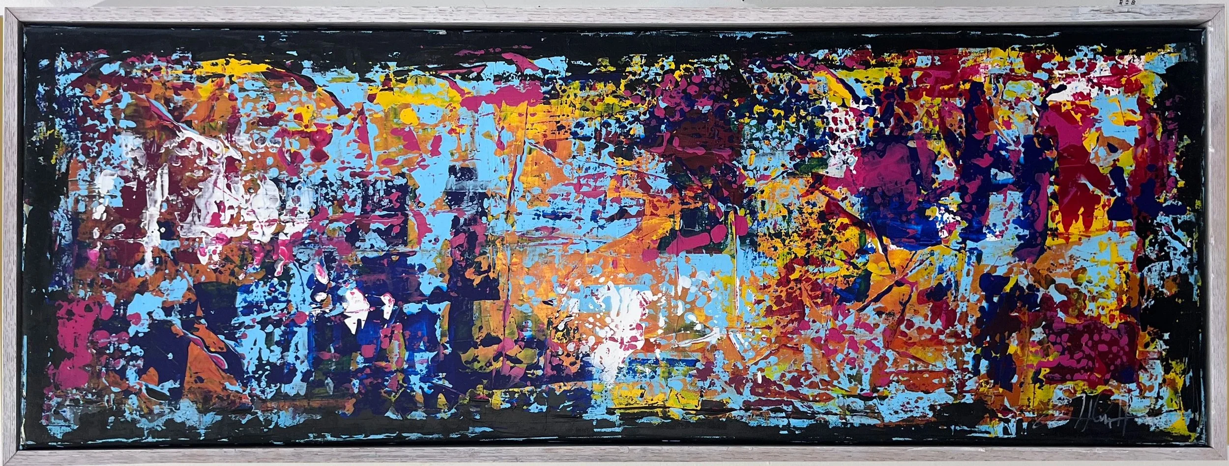
Ship Yard captures the layered energy and color of a busy marina. Bold strokes and overlapping textures suggest tall masts, weathered hulls, reflections, and flashes of color along the waterfront. This long horizontal composition becomes a lively abstract harbor scene, energetic, and filled with the rhythm of life on the water.
Ship Yard
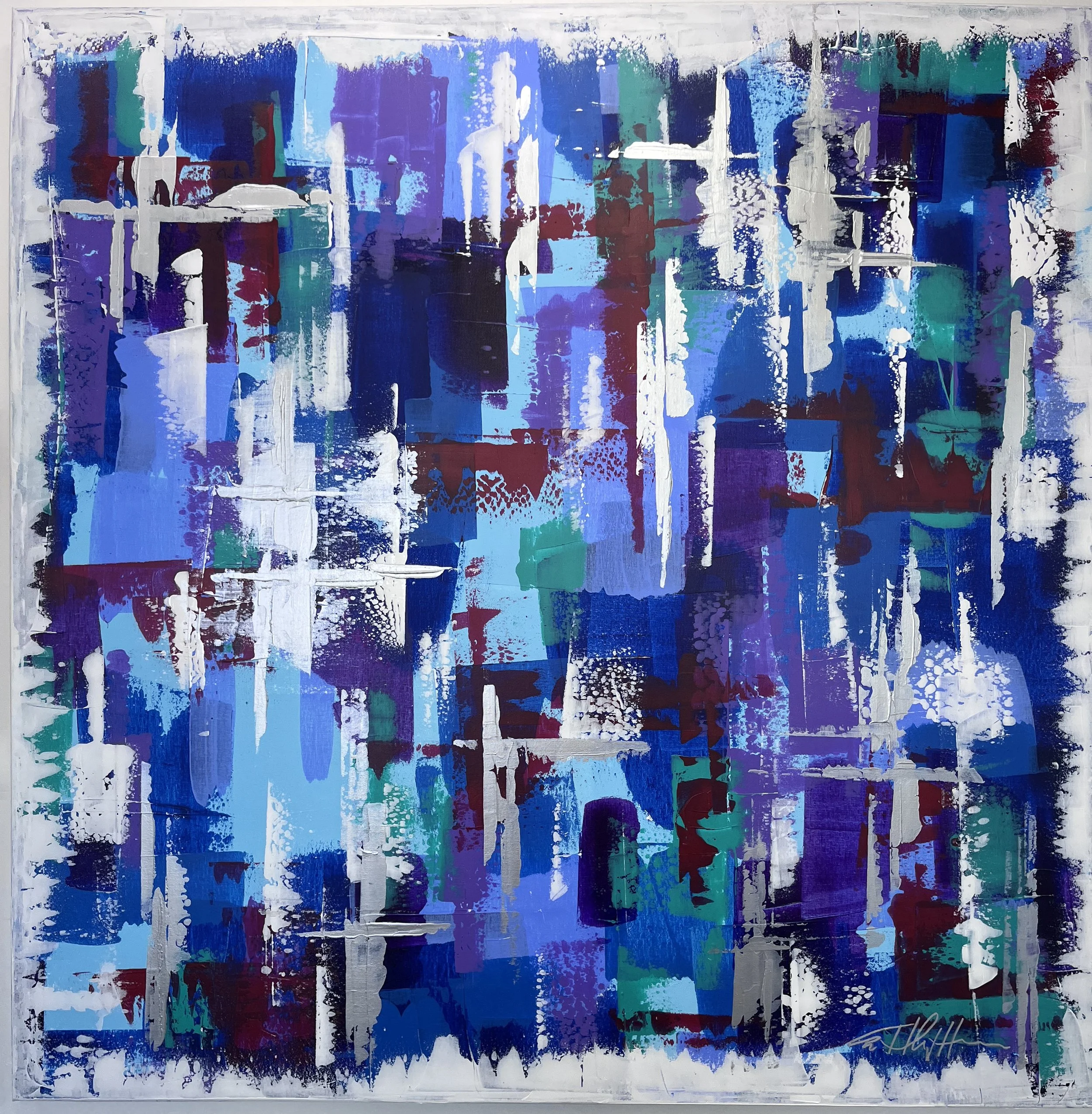
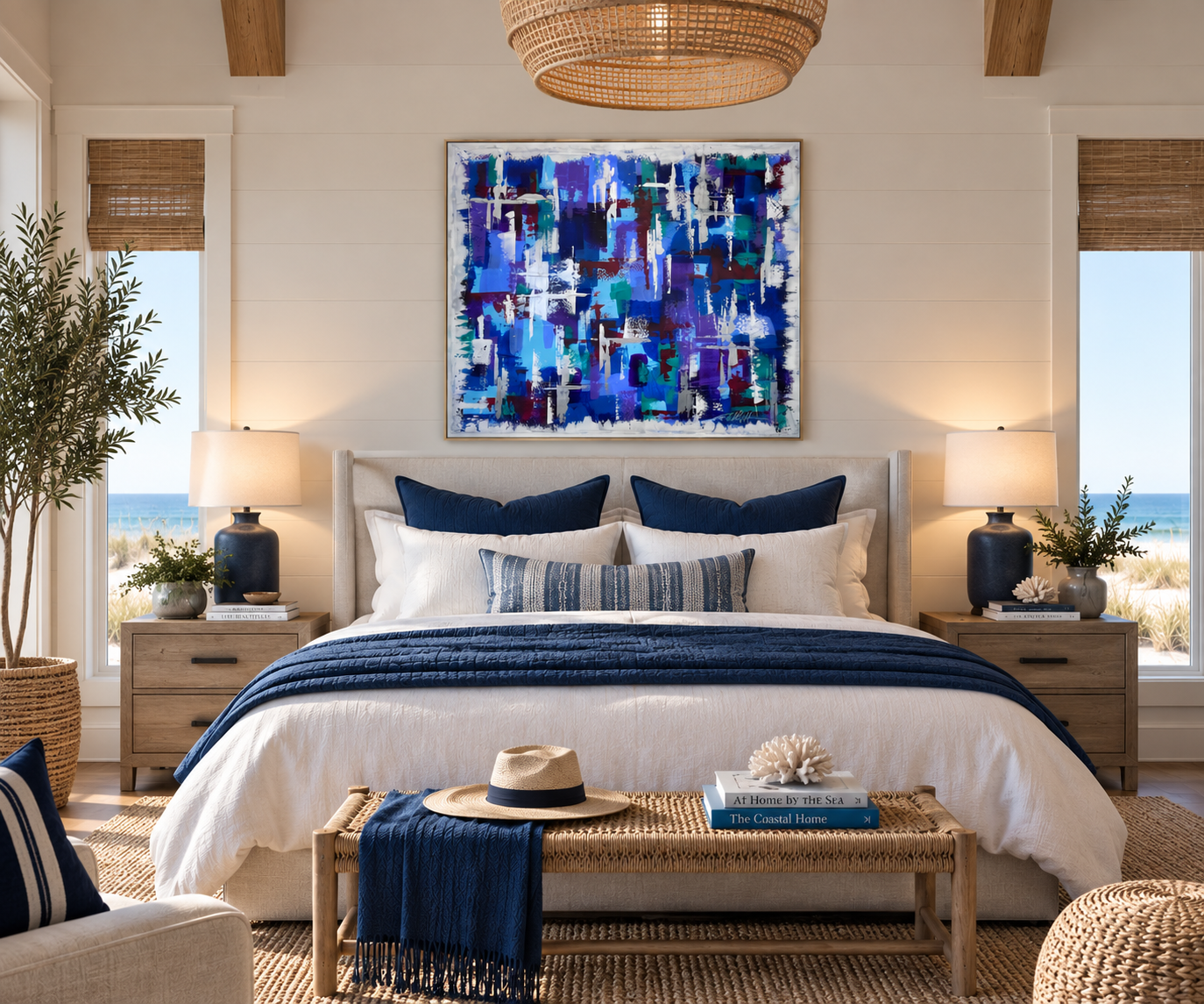
White Caps captures the restless energy of wind moving across open water. Layers of deep blue, turquoise, violet, and teal create a sense of depth and motion, while broken strokes of white sweep across the surface like waves catching the wind. The painting is less about a specific place and more about the movement, rhythm, and changing colors of water on a windy day.
White Caps
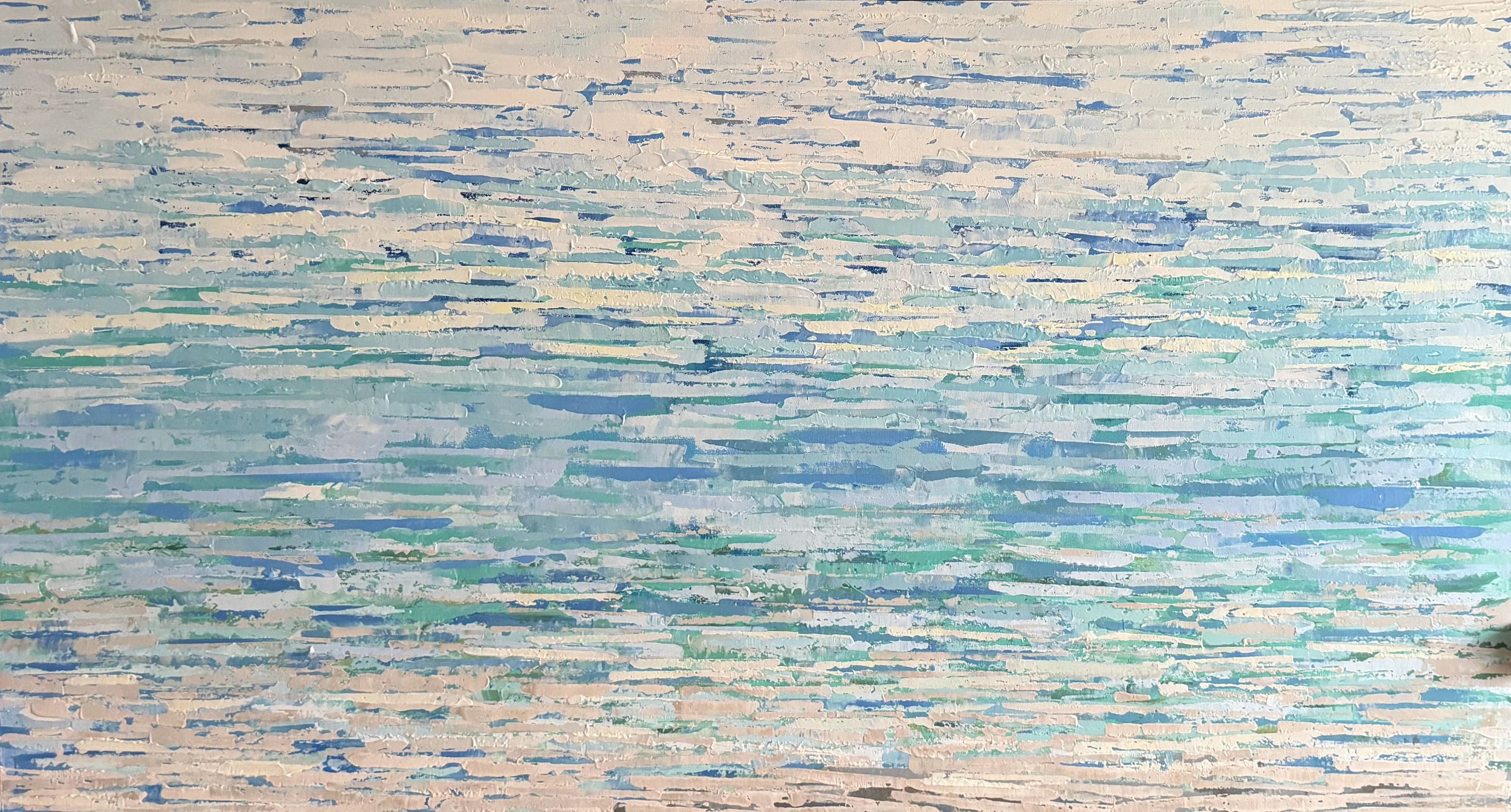
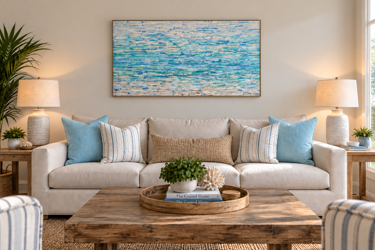
Beach Vibes Inspired by the shifting colors of the shoreline, Beach Vibes layers soft blues, turquoise, seafoam, warm sand, and white to capture the feeling of water meeting the coast. Rather than depicting a specific beach, the textured horizontal strokes suggest movement, waves, reflections, changing light, and the quiet rhythm of the ocean.
Beach Vibes
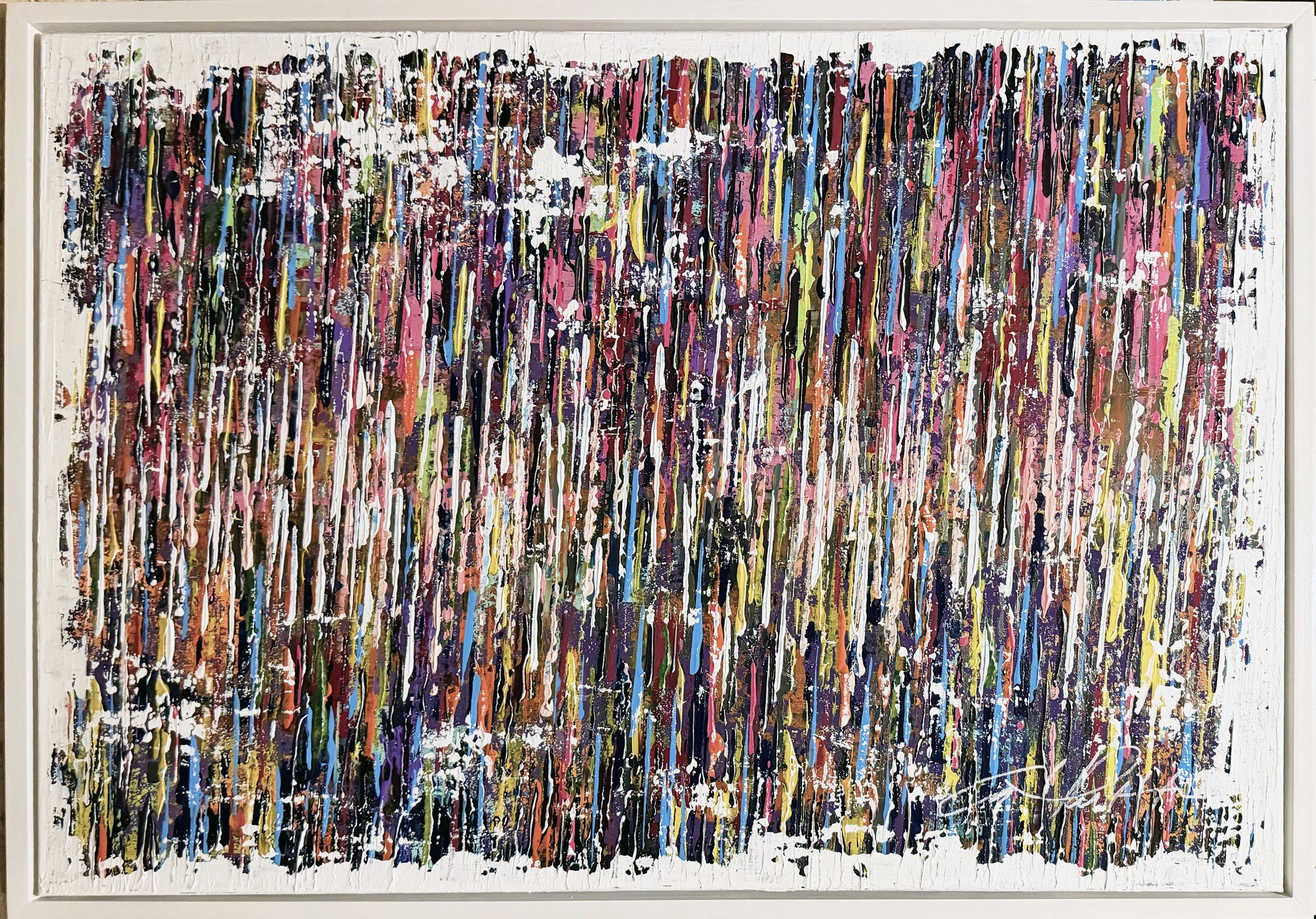
Skewed View In Skewed View, layers of vivid color and rhythmic vertical marks reflect the unique ways a person may experience and perceive the world when living with a cognitive or mental challenge. The interplay of structure, disruption, and movement suggests a personality that may differ from expectations, while celebrating the individuality and complexity that make each person unique.
Skewed View